This page shows the changes, and progress that I made to the Addix brand in the time that I was the Creative Director. It is in chronological order, so as you scroll through you can see the progression.

This is what the customer facing mockups looked like when I began at Addix. The company had two websites, wrestling addix, and football addix. Not shown on this specific mockup were the colors used in the design, which was normally listed in the top right corner. Very non descriptive mockup, with the main focus on the artwork.
________________________________________________________________________________
The owners of the company were wary to change their ways, so my first major introduction to making a solid brand identity was introducing a more uniform font. All previous mockups were created using Serpentine Bold (which was also used in their logo), and Impact Regular.
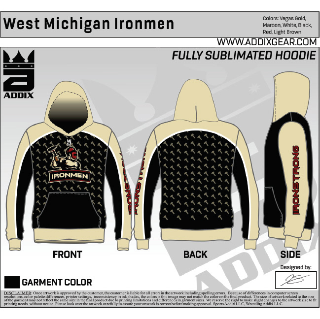
After selecting a few fonts we landed on Rogan. This font had many weights to accommodate consistency, but also variety. At this stage I was also able to direct all branding towards one site/company identity.
After selecting a few fonts we landed on Rogan. This font had many weights to accommodate consistency, but also variety. At this stage I was also able to direct all branding towards one site/company identity.
AddixGear.com
This removed the confusion from having multiple websites/social media accounts, as the number of sports that Addix offered apparel for was constantly growing.
Also at this stage in the process I added a "designed by" section. This was to show customers that an actual designer was being assigned to their team/school/organization. It also helped internally, when files needed to be found, or an issues arose with artwork.
Also at this stage in the process I added a "designed by" section. This was to show customers that an actual designer was being assigned to their team/school/organization. It also helped internally, when files needed to be found, or an issues arose with artwork.
________________________________________________________________________________
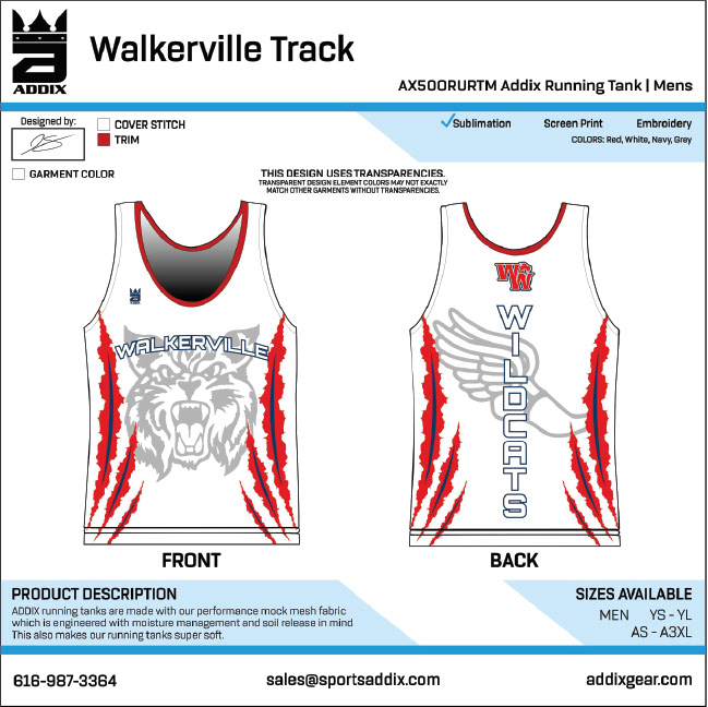
After seeing the improvements, the owners wanted to grow on these ideas. So I created a brand identity for the company, including Rogan, when to use each of the font weights (header, subheader, body, etc) and brand colors. With all of those now at the companies disposal, I took on the task of solving repeated concerns and issues, both from customers and internal communications. From that came this final mockup that I created at my time in Addix.
This mockup introduced product codes, to be sure that what was being requested by the customer would be used all the way through the production process. Cover stitch colors were now also being selected, so that in the future, repeat orders would be produced the same. Sublimation, Screen Printing, and Embroidery options showed the customer exactly what process their designs would be created with. A product description, and available sizing gave crucial information to the customer when deciding if this product was right for them. Also the team name displayed at the top was how you would find the order, artwork, and production files in the Addix system. Finally, all contact info was displayed at the bottom, so anyone who would stumble across a mockup on the internet could contact us for their own apparel.
This mockup introduced product codes, to be sure that what was being requested by the customer would be used all the way through the production process. Cover stitch colors were now also being selected, so that in the future, repeat orders would be produced the same. Sublimation, Screen Printing, and Embroidery options showed the customer exactly what process their designs would be created with. A product description, and available sizing gave crucial information to the customer when deciding if this product was right for them. Also the team name displayed at the top was how you would find the order, artwork, and production files in the Addix system. Finally, all contact info was displayed at the bottom, so anyone who would stumble across a mockup on the internet could contact us for their own apparel.
________________________________________________________________________________
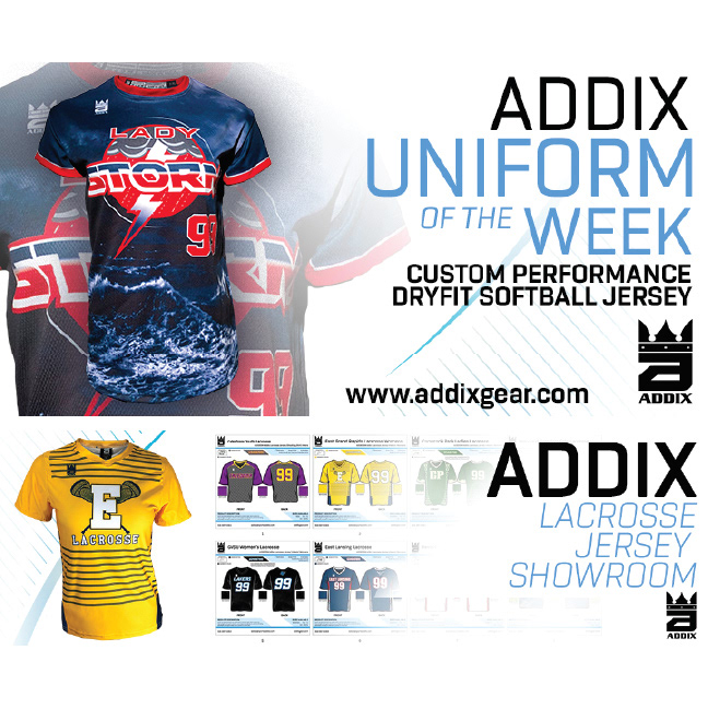
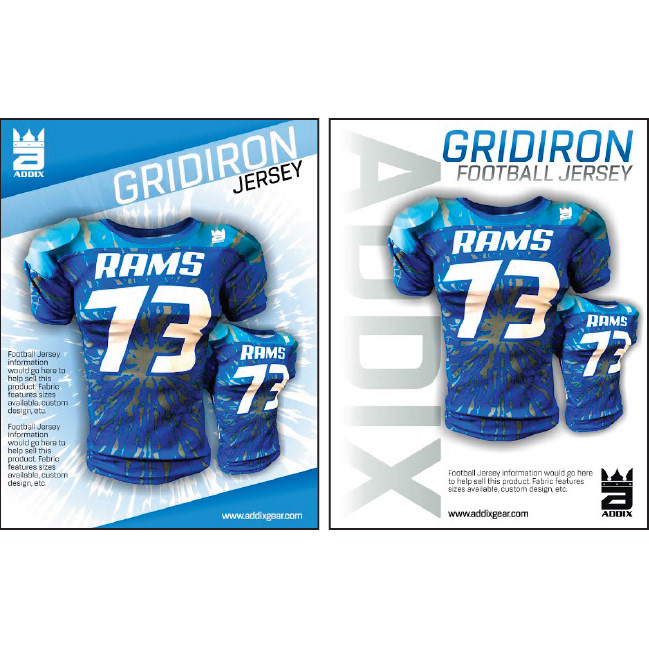
With those changes launched, I was able to focus on keeping consistency within all marketing materials. Below are a few examples of my use of the brand colors, fonts, and contact info.
________________________________________________________________________________
Finally, everything was in place, and we were able to relaunch addixgear.com to match all of my efforts. This complete overhaul took place over the period of a month, as I created the whole site from scratch. I called on the brand guidelines, user interaction, and responsiveness to develop the final site layout. The site received a lot of praise from customers, and the site traffic grew exponentially.